'PORTAL' - PROTOTYPE TINY HOUSE ON WHEELS
TINY HOUSE ON WHEELS / 18m² internal, 10m² deck
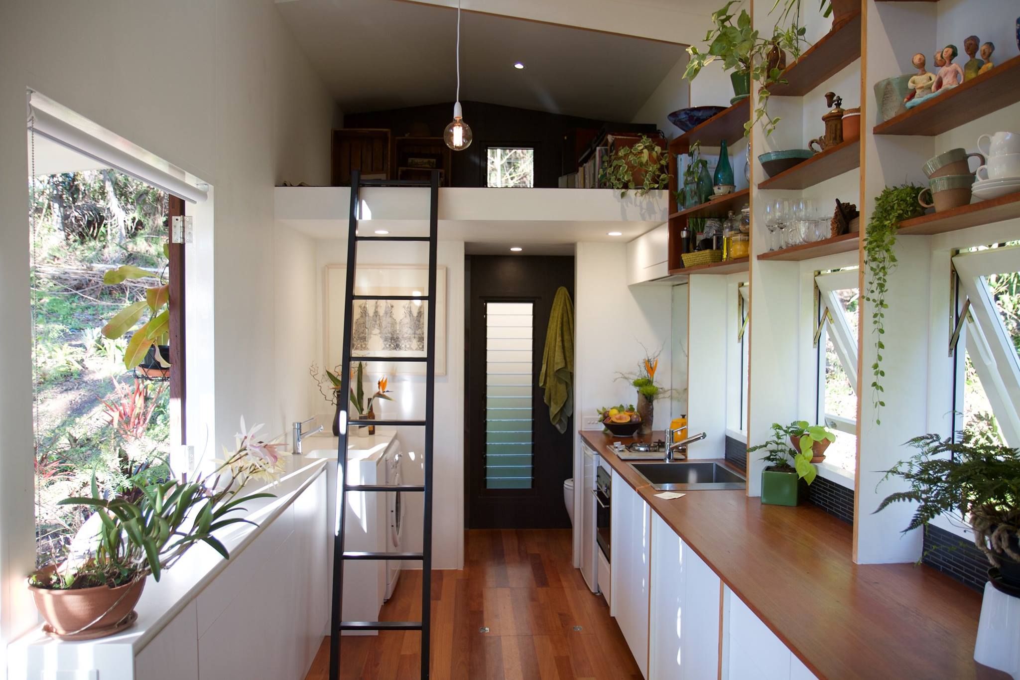
'PORTAL' is our flagship design, featuring high-end detailing and fixtures, a modular demountable deck system, a custom-designed retractable bed and custom cabinetry between a grid of 'portal' frames.
This design has been featured in an array of online and print magazines, formed the basis of public lectures, radio and film interviews, and travelled up and down Southeast Queensland for open house events including Woodford Folk Festival.
Making the most out of our 18 square metres of floor area has relied on two key strategies and a whole lot of careful detail decisions. Read on to learn more...
SIGHT LINES, RHYTHM AND ASPECT
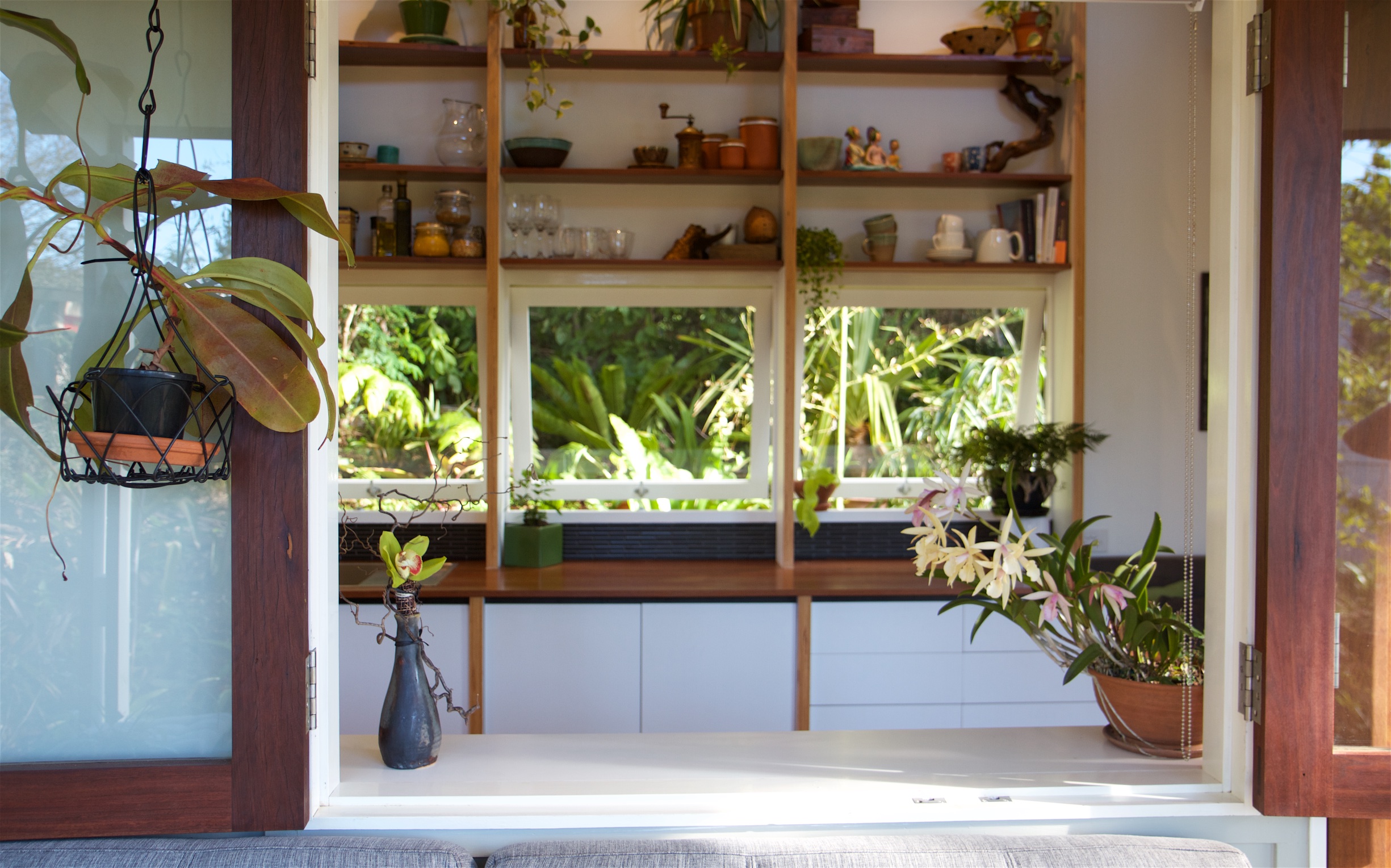
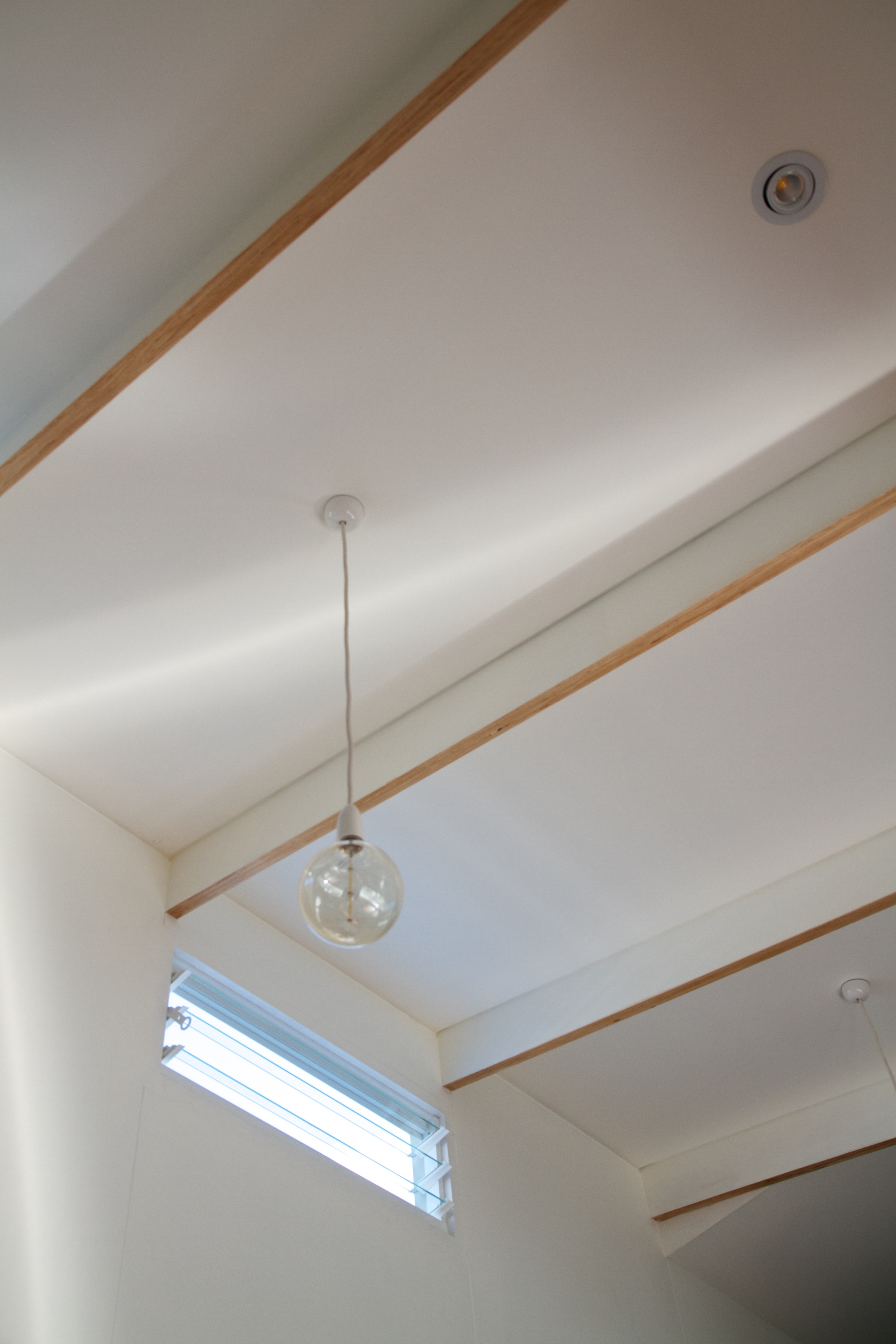
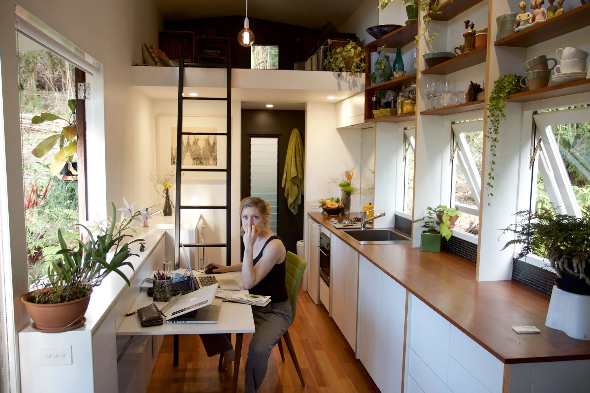
Continuous sight lines through the length and width of the house help to provide a spacious feel. Doors and windows are aligned to lead the eye the house and out to the surrounding garden and provide very effective cross-ventilation and stack ventilation (through the high louvres). With correct design, small spaces such as this can be passively heated and cooled in an instant.
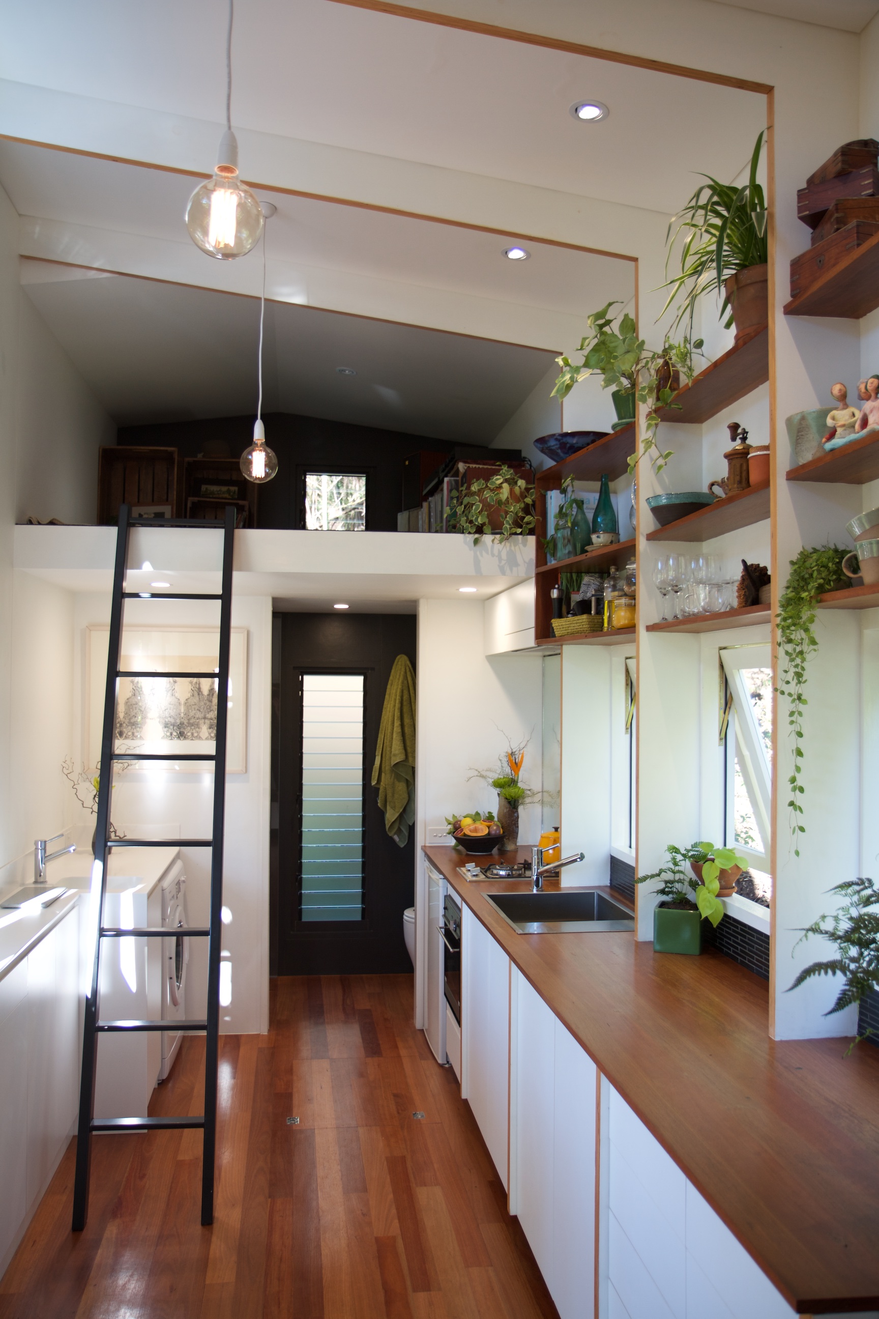
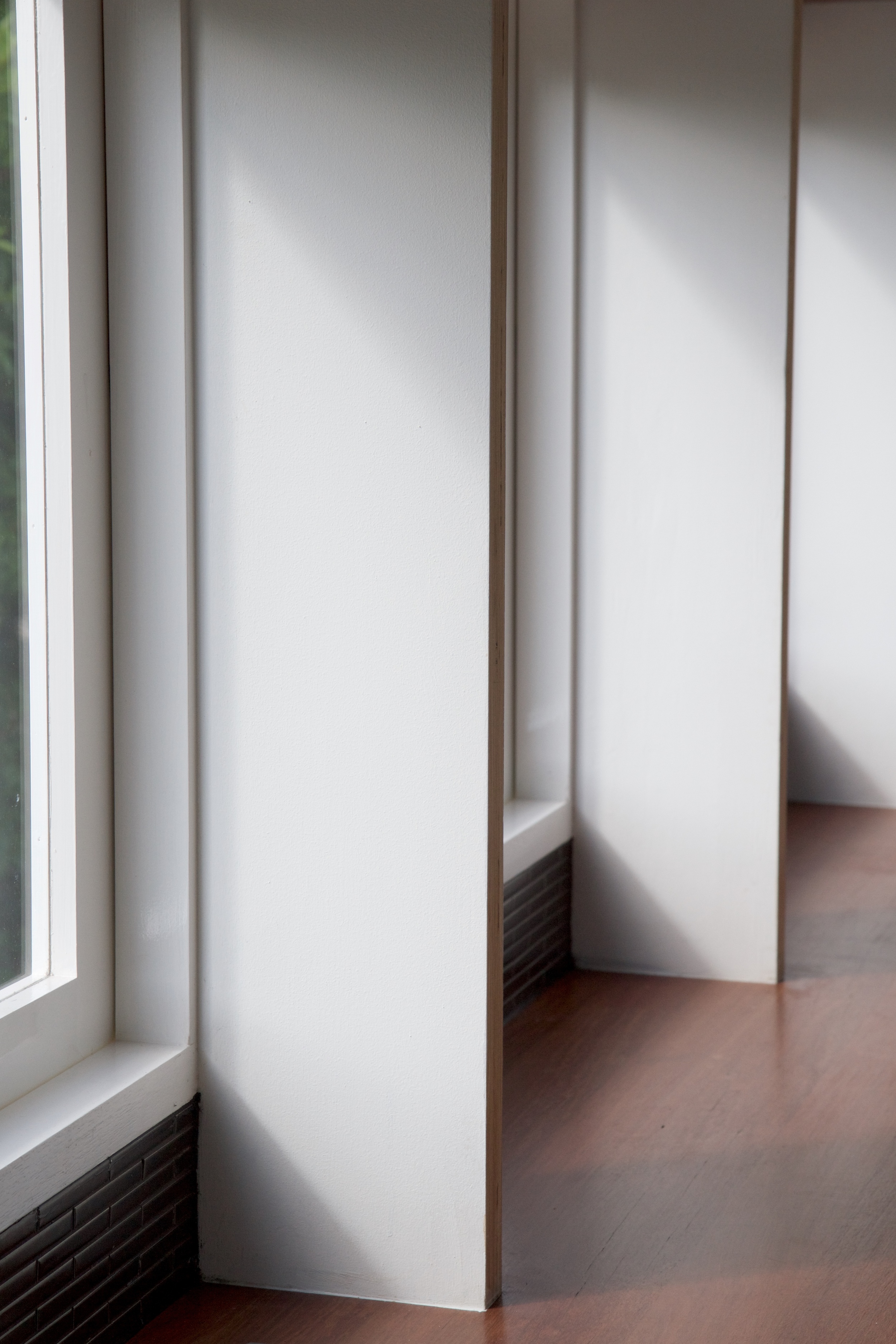
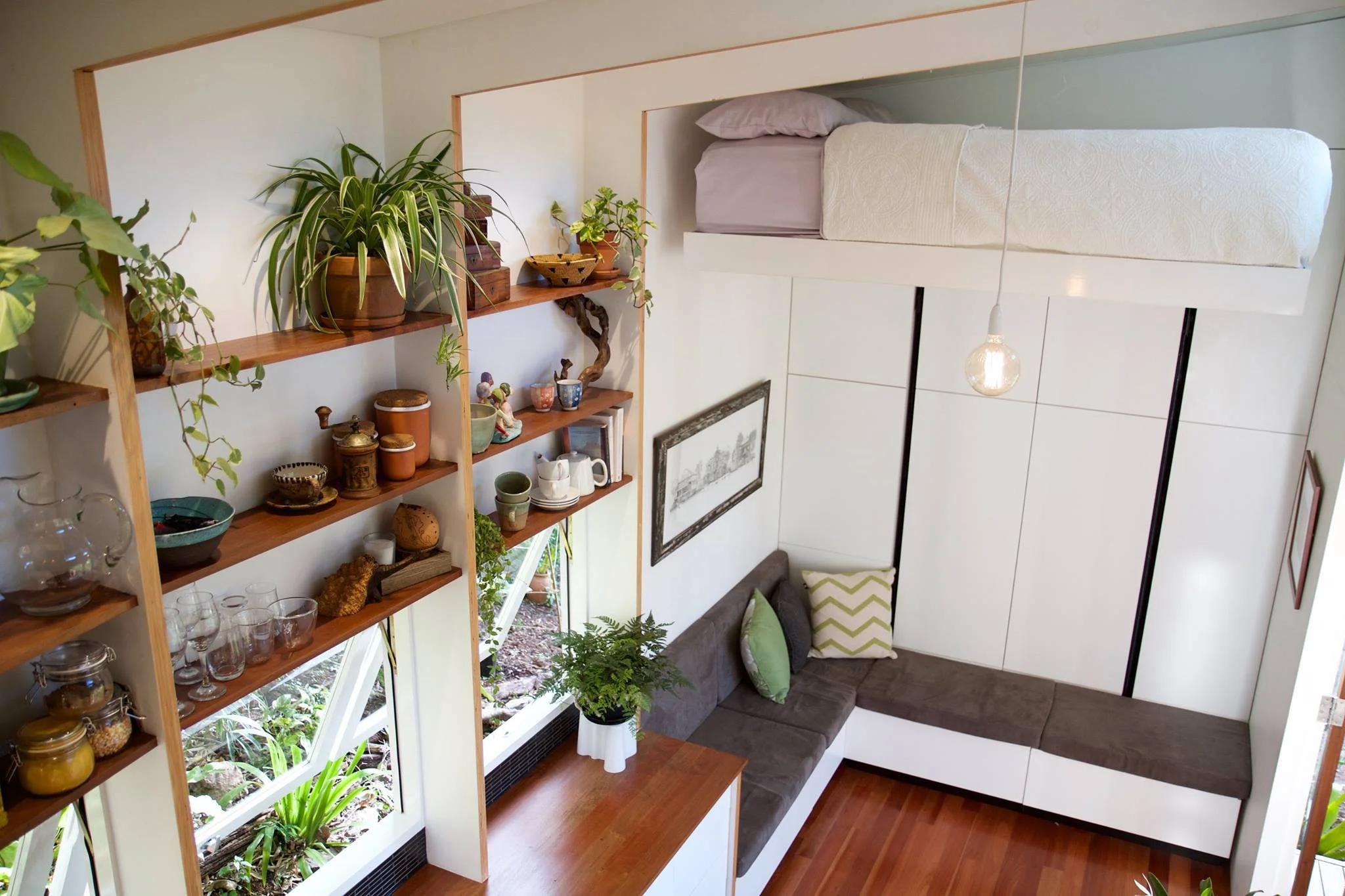
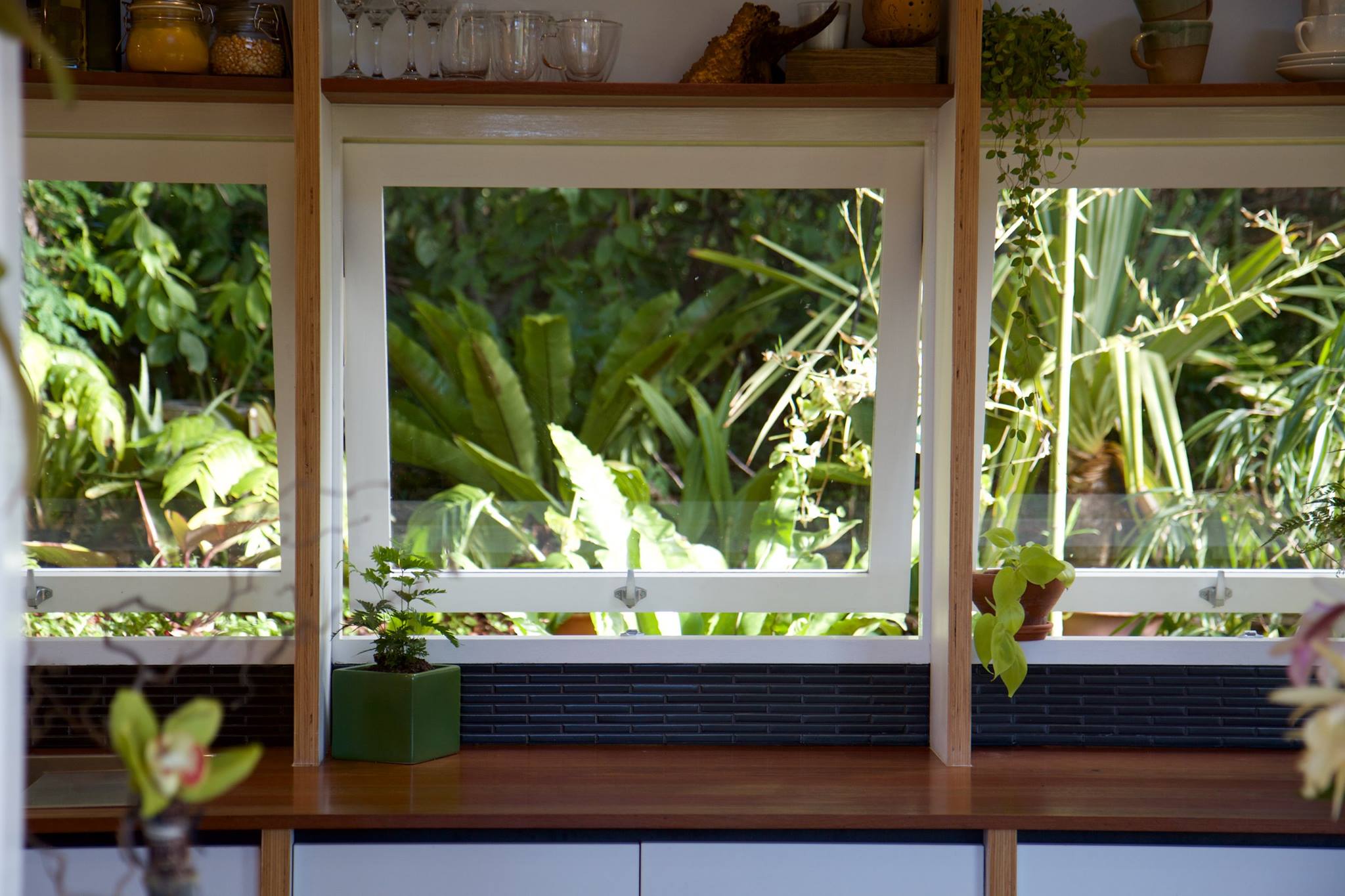
With almost everything visible from the one living space, establishing clear patterns and aesthetic rhythms helps to organise the space - de-cluttered and ordered views tend to feel bigger. The central space and deck are all organised around a 900mm grid which dictates the placement of exposed LVL frames, kitchen cabinets, doors and windows.
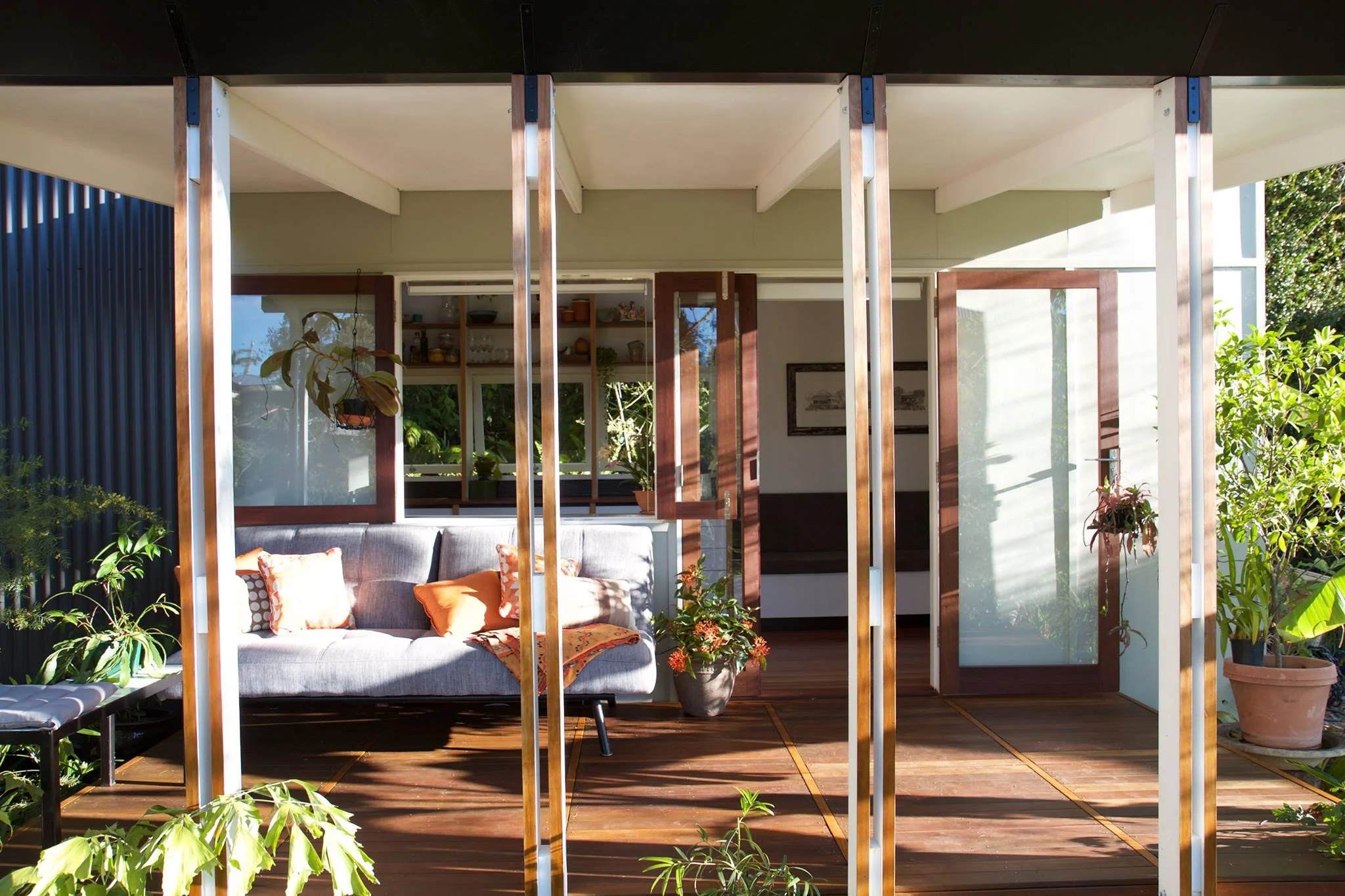
The joists, posts and rafters of the deck line up with the grid of internal portal frames. Windows fit seamlessly between the portals and detailing is painstakingly carried throughout with the portal frames, window jambs, joists and deck posts all matching in width, location and proportion.
A raking ceiling, side main entry, deck positioning, and material selection are used to establish a clear direction to the space - opening out towards the deck area and high louvre windows and providing visual and spatial relief. Clean lines and white surfaces lead the eye past the North wall and towards the deck, contrasting the rich tones and busier detailing of the South wall.
CELEBRATING THE HIGH SPACE
Put simply, when width is limited it can help to accentuate the height. While some tiny houses place a generous loft space above a low-ceiling wet area, we opted for the extra head height in the bathroom and laundry - two spaces that we believe are used too frequently to skimp on.
THE DEMOUNTABLE DECK
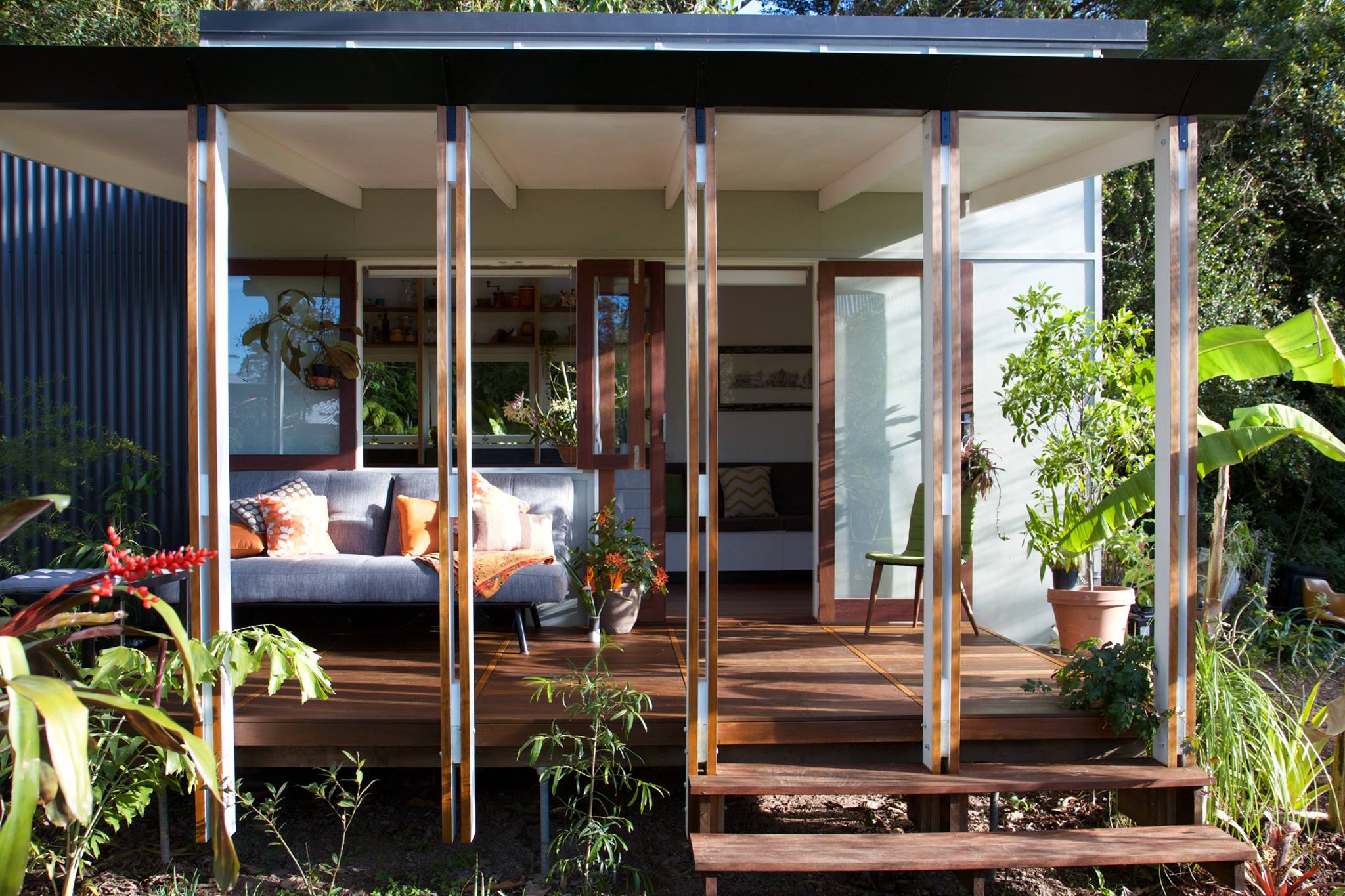
Our modular, demountable deck almost doubles the floor area of the house. Its detailing and finish match the interior space and each modular bay lines up with the internal rhythm of portal frames, cabinets and windows. Despite the ease with which it can be detached, it reads as an integral part of the tiny house.
Adjustable legs and bolt-on construction methods provide flexibility while maintaining a 'permanent' aesthetic.
For the off-grid enthusiasts, the deck roof almost doubles the rainwater catchment area and provides an ideal North-facing location for solar panels.
THE RETRACTABLE BED / LOUNGE SUITE
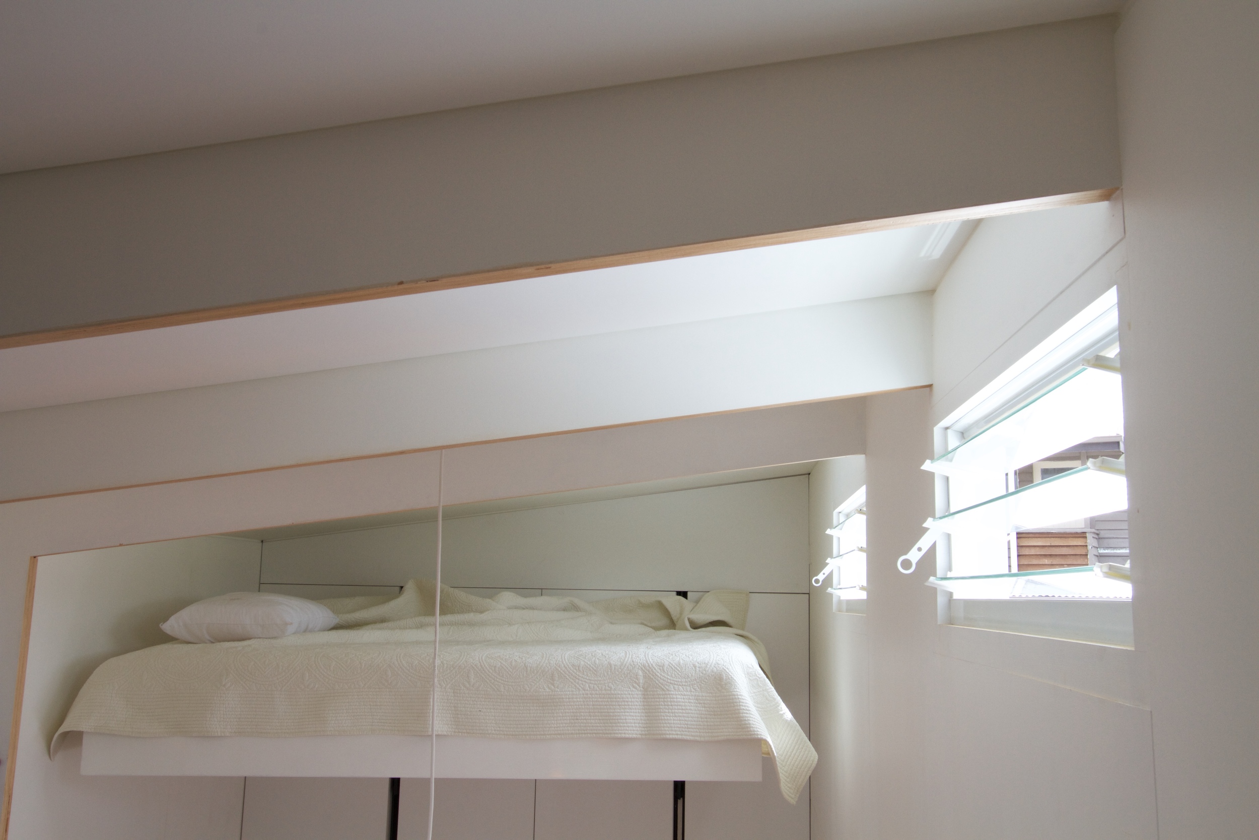
How do you deal with every function of a house competing for 18 square metres of floor space? By combining two spaces into one. Not a fan of pokey loft beds? Our retractable bed has 3m of headroom by night and floats over a 2.4m lounge space by day. Controlled wirelessly by remote, this bed needs no folding, no packing away...you don't even have to make the bed. Out of sight, out of mind.
The bed and lounge seating work in unison. As the bed lowers onto the cushions it slips past the backrest which becomes a padded headboard when fully lowered. Cushions, pictures and wall-mounted screens can all remain in place. All that's required is the push of a button.
The bed was designed and built by Nathan Nostaw in collaboration with The Tiny House Company. It was a challenging brief, requiring him to be sensitive to the design of the space and tie his work in aesthetically. What presents as a simple, elegant solution is the result of many hours of careful design and precise construction. With a list of ergonomic considerations and safety features built in.
THE BATHROOM
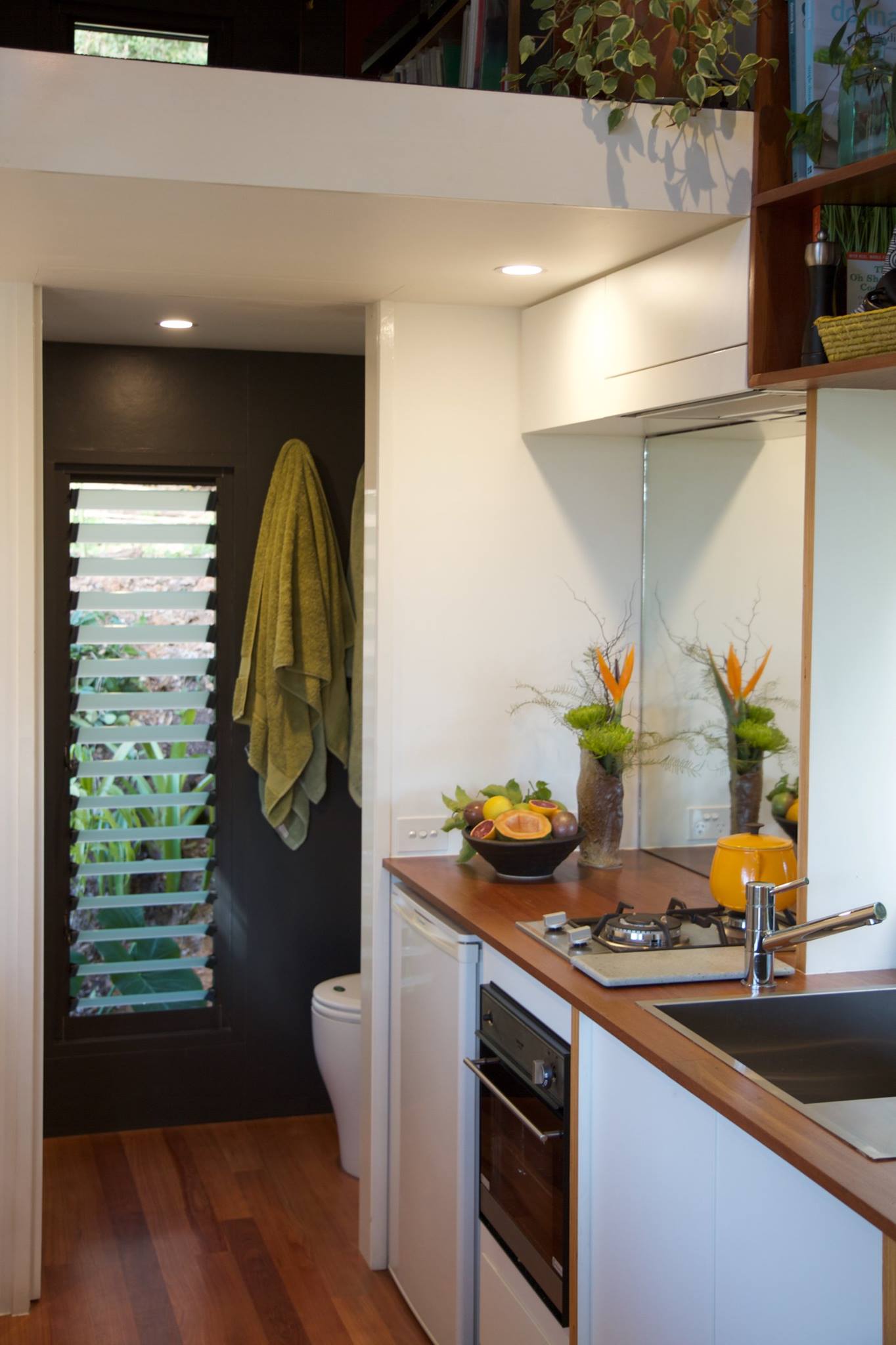
Continuous hardwood flooring and a flush set cavity sliding door tie the bathroom in with the rest of the house. With the door open it becomes an extension of the main space, with long views out through the tall louvre gallery. A semi-framed shower screen maintains clean lines and an open feel that is so essential to compact spaces.
Recessed hardwood shelving provides storage and display area without cluttering the space. A 2.1m high ceiling is maintained throughout with recessed downlights.
STORAGE...LOTS OF IT


