Kitchen Renovation in a 100 year old Queenslander
KITCHEN RENOVATION
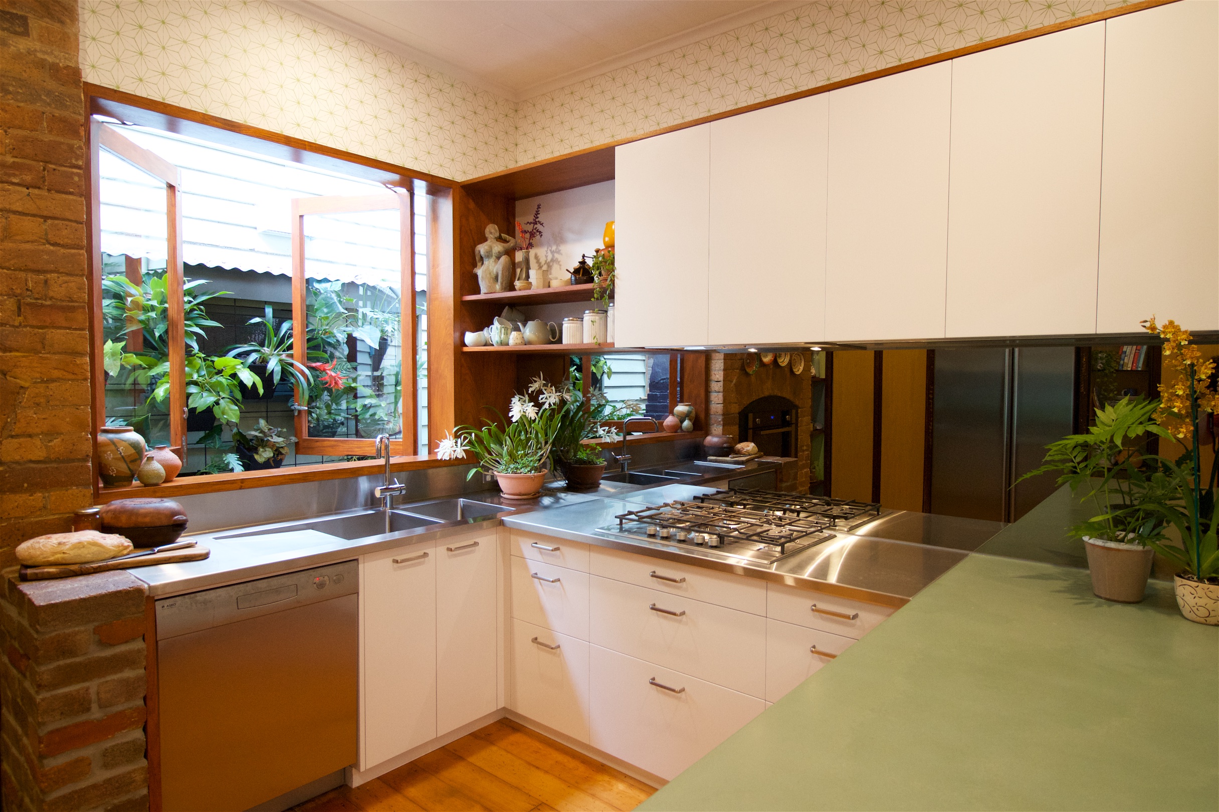
This long-overdue project presented a tricky challenge: balancing a desire for warmth and character with the practical considerations of a very high-use kitchen. For decades this room has pumped out delicious food at an almost commercial scale and so we opted for a combination of concrete and stainless steel - not materials you’d typically describe as ‘warm’.
A huge thanks to Peter and Annie for trusting us with some unorthodox details and material combinations.
BEFORE AND AFTER
Reducing clutter on the walls was low-hanging fruit of course, but these before and after images show a few of the other key strategies.
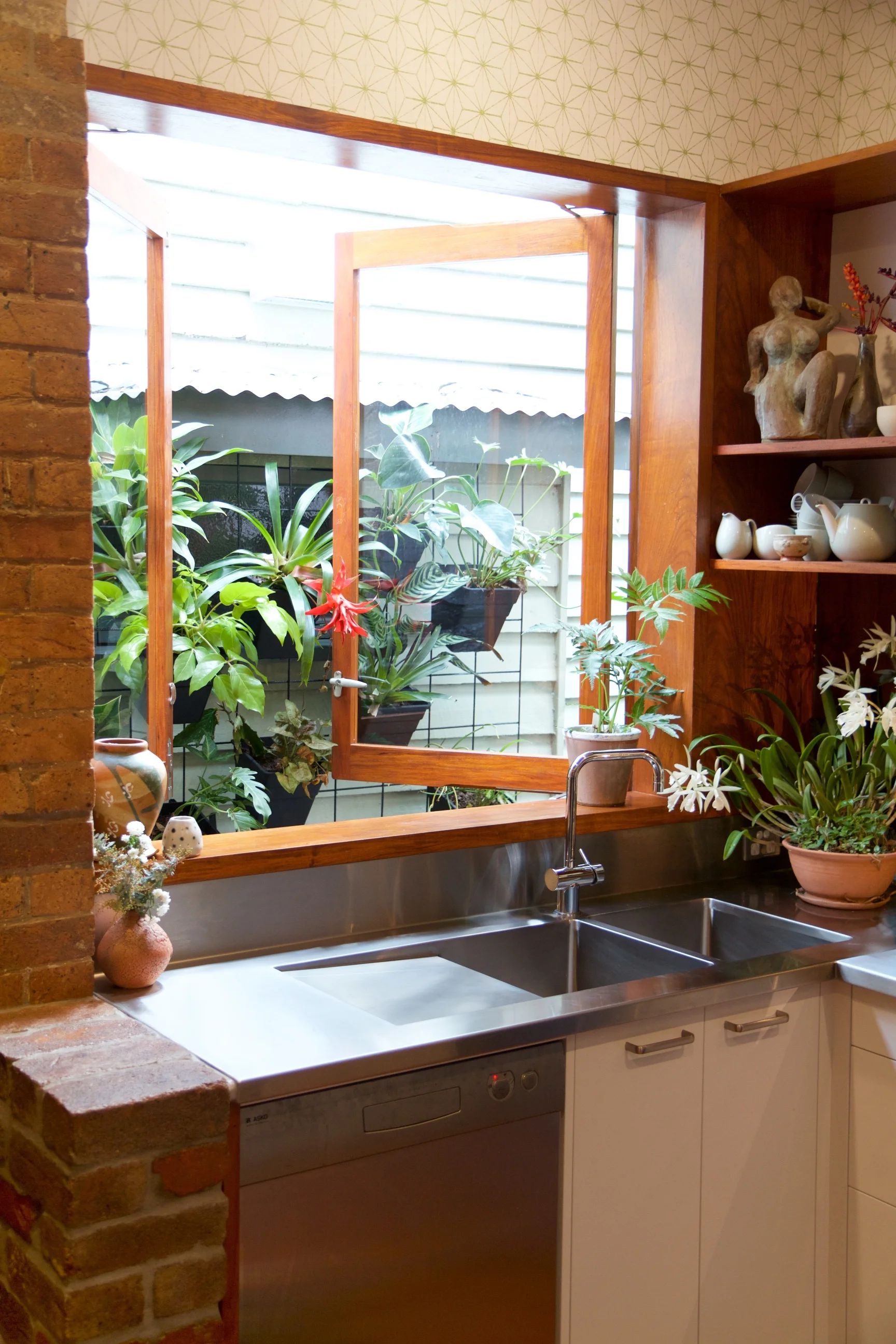
Firstly, in a somewhat counter-intuitive decision, we reduced the overall window area. In doing so we were able to continue the prominent step in the existing brick fireplace across the whole room as a datum (seen better from other angles) with the top of window and top of overhead cupboards all lining up.
We also pulled the right hand side of the window away from the wall to allow the overhead cupboards and open shelves to meet neatly in the corner, to prevent the sense of clutter from cupboards obstructing the view of the window.
A brick plinth was added to settle the new work into the existing while adding a hard-wearing horizontal surface for hot trays fresh out of the oven.
The simple, neutral stainless steel benchtop and splashback reflect and complement the warmth of old (very old) brick and new guinea rosewood joinery.
MIRROR SPLASHBACK - THE CHEAPEST EXTENSION YOU’LL EVER DO!
A full-width mirror glass splashback throws light and colour around the room and adds a sense of extra space that’s not really there - the cheapest extension you’ll ever do! With otherwise plain and neutral tones in the stainless and white doors/drawers, the mirror splashback draws extra attention onto Pop Concrete’s gorgeous green concrete benchtop and the colourful foods on the cooktop.
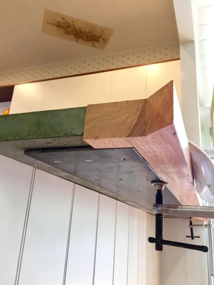
GREEN CONCRETE WITH ROSEWOOD EDGE - AN UNUSUAL COMBINATION


